
The Rolling Oats
Co Founder, Co Director & Head Designer
Opened in Novemeber 2019 The Rolling Oats is a Buckinghamshire based mobile refill shop.
A plastic free shop that encourages customers to bring their own container to refill with ethically made, locally sourced and biodegradable produce - with the vision to eliminate single use plastic for the consumer.
The Rolling Oats was a very exciting branding project, across many, many medias.

The Main Logo & Branding
Designing The Rolling Oats logo was an exciting project.
From a tiny favicon to a large scale painting, this logo had to be flexible from the start- it had to allow for use online, in print and be hand replicated in varing sizes on various materials.
Once the main logo was developed elements from the design were encoporated into other marketing materials, thus strengthening the brand.
Elements iubncluded colours, stroke thickeness, typefaces and images.
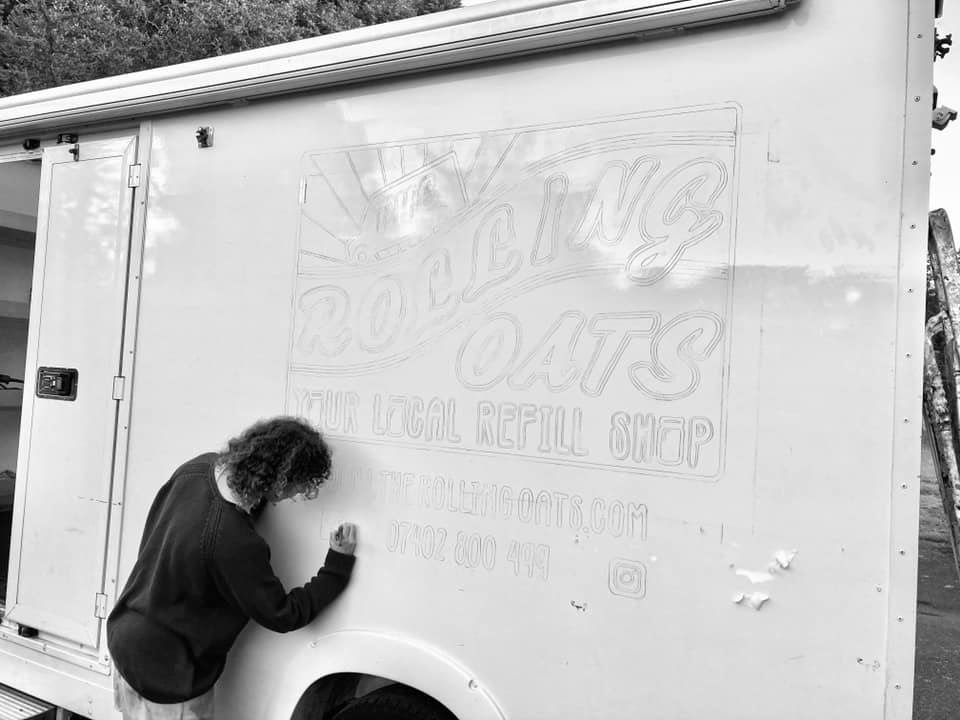
Freehand Details

Drawing The Logo On

First Paint Going On The Van

Just The Black To Go !

Two Of The Outside Logos

Main Logo, Front Blackboards & Banner

Weathered Small Logo Side Of Van
Favicon Logo For Social Media

Facebook Profile Page

A Board On Buckingham Market Square

Blackboard Typography


Front Blackboards

Drop Off Point
Interior Design For The Rolling Oats
Designing the interior of The Rolling Oats van was a careful balancing act of aesthetics and functionality within a small, confined space.
The varied stock had to be clearly displayed, with suitable containers found to fit the products and space. Ergonomic design for full accessibility and comfort for customers was a must and building in some hidden storage for the staff was ideal.
Signage, including labelling, had to be clear and consistent across numerous container types, with all the necessary information, as well as being able to withstand time, plenty of handling and of course, movement, when the van was mobile.

Sketch Up Diagram

Building The Interior

Dried Fuits, Seeds & Nuts

Gravity Feeders

One Side

Cleaning Products

Interior Way Finding Signs

Customer Interaction

Under The Countertop

Kids Blackboard Inside The Van

Flour Containers

The Back Of Van
Digital Presence
You can’t have a buisness without having a strong online presence.
The Rolling Oats main website was built to display our whereabouts and a detailed list of stock.
Online social media platforms such as Facebook and Instagram provided a connection to customers where we held competitions, announced news and kept customers interested with recipes, plastic news and behind the scenes sneek peeks.
The Rolling Oats online shop was developed within the first few weeks of launching the business with the intention of providing a service to those isolating or sheilding due to COVID 19.
It involved catergorsing, photographing and detailing every item of stock within the van.

Online Shop Homepage

Main Website (Homepage)

Main Website (Stock Page)

Facebook Profile

Online Shop On App (Front Page)

Online Shop (Detail)

Online Shop (Detail)

Online Shop (Pop Up Page)

Online Shop

Online Shop (Ordering Page)

App Advert

Facebook Profile Homepage
Marketing & Advertising
Typefaces, strokes, colours and icons were then extracted from the main logo to be used in markting material for both print and digital media.

A5 Original Leaflet (Front With Extra Slip)
A Board On Market Square

A5 Recipe Cards

A5 Leaflet Design Back

A4 Poster Design

Advertisment (Half Page)

A3 Mind Map

A4 Various Poster Designs

Buisness Cards

Advertisment (Quatre Page)

A5 Leaflet Design (Front)

Competition Time

Guess The Weight

A5 Towersey Festival Advert

Gift Cards (Back & Front)
Buisness Cards (Back)
